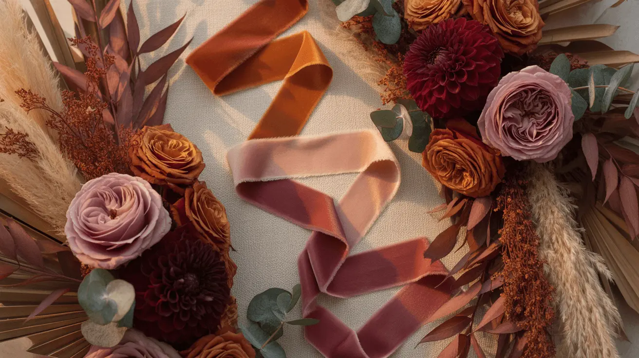
Fall Wedding Color Palettes That Photograph Well
This post contains affiliate links, which means I may earn a small commission if you buy something through them, at no extra cost to you.
A fall wedding color palette almost always works on the moodboard and comes apart by four o’clock. The screen you chose it on throws cold blue-white light; the October sun is low and orange and getting more orange every minute after lunch.
So the sage-and-lavender board that looked crisp the night before comes back from the photographer as grey-olive and grey-mauve. A fall wedding color palette has to hold up in that light, not on the screen you built it on.
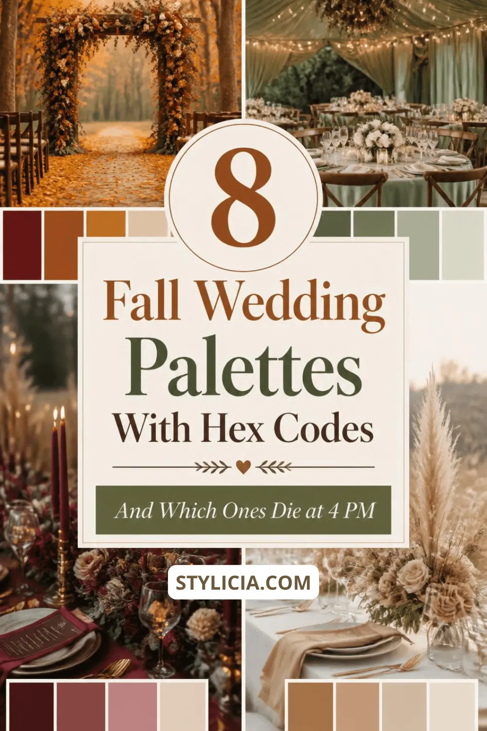
This article is the fall wedding color palette and nothing else. Eight fall wedding color schemes with hex values, what each does to a room, and which survive low warm light.
Carrying a fall wedding color palette through a whole wedding day is a different job, covered in how black and burgundy plays out across a reception.
Blooms are in which fall flowers are actually in season, and table layers in napkins, chargers and linens for autumn tables.
October Light Is Warmer, Lower, and Less Forgiving Than a Moodboard
Warm light adds yellow and orange to everything it touches. Free saturation for a burgundy, a tax on a lavender. That is the first thing a fall wedding color palette has to survive.
A color built from red and orange wavelengths gets amplified by a low sun. One built on blue and green has nothing to gain, so it slides toward grey.
In practice: the bridesmaids you picked as soft sage stand in the last good hour of light wearing dusty olive, and the pictures feel flat without anyone naming why.
(And yes, this is the opposite of what most palette guides tell you. They rank autumn colors by mood, a judgment made on a backlit screen at midnight.)
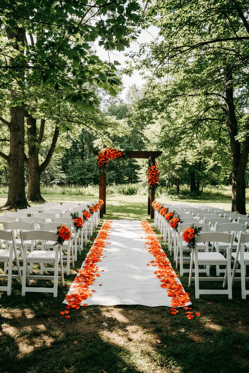
One test settles it. Order physical swatches, stand where the ceremony will be, and photograph them at the hour the ceremony starts. Not noon, not on a cloudy Tuesday. Your phone white-balances the scene the way the photographer’s camera will.
Digital palette generators show you color on the one light source your wedding will not have. A paint fan deck gives you real pigment on paper you can carry outside.
The fan decks sold on Amazon run about $10 to $25, and one covers every color decision you make this year.
Feel free to throw out a color you loved after that test. Cheaper than throwing out eleven bridesmaid dresses.
Eight Fall Wedding Color Schemes at a Glance, With Hex Values
Every fall wedding color palette here is three colors, because three stays coherent across a ceremony, a reception and forty tables.
| Palette | Hex values | Lightness spread | Holds at 4 p.m.? |
|---|---|---|---|
| Burgundy · dusty rose · antique gold | #6B1F2E · #C89A97 · #B08D57 | 22% to 66% | Yes, gains warmth |
| Terracotta · cream · olive | #C86B4A · #F1E7D8 · #6E7350 | 43% to 91% | Yes, if cream stays |
| Rust · mustard · chocolate | #A9482C · #D9A441 · #4A3227 | 22% to 66% | Yes, very forgiving |
| Chocolate · butter yellow · ivory | #4A3227 · #F0DFA0 · #FBF7EF | 22% to 97% | Yes, best spread here |
| Oxblood · black · bone | #4E1B1B · #1A1A1A · #E8E0D3 | 10% to 88% | Yes, needs candlelight |
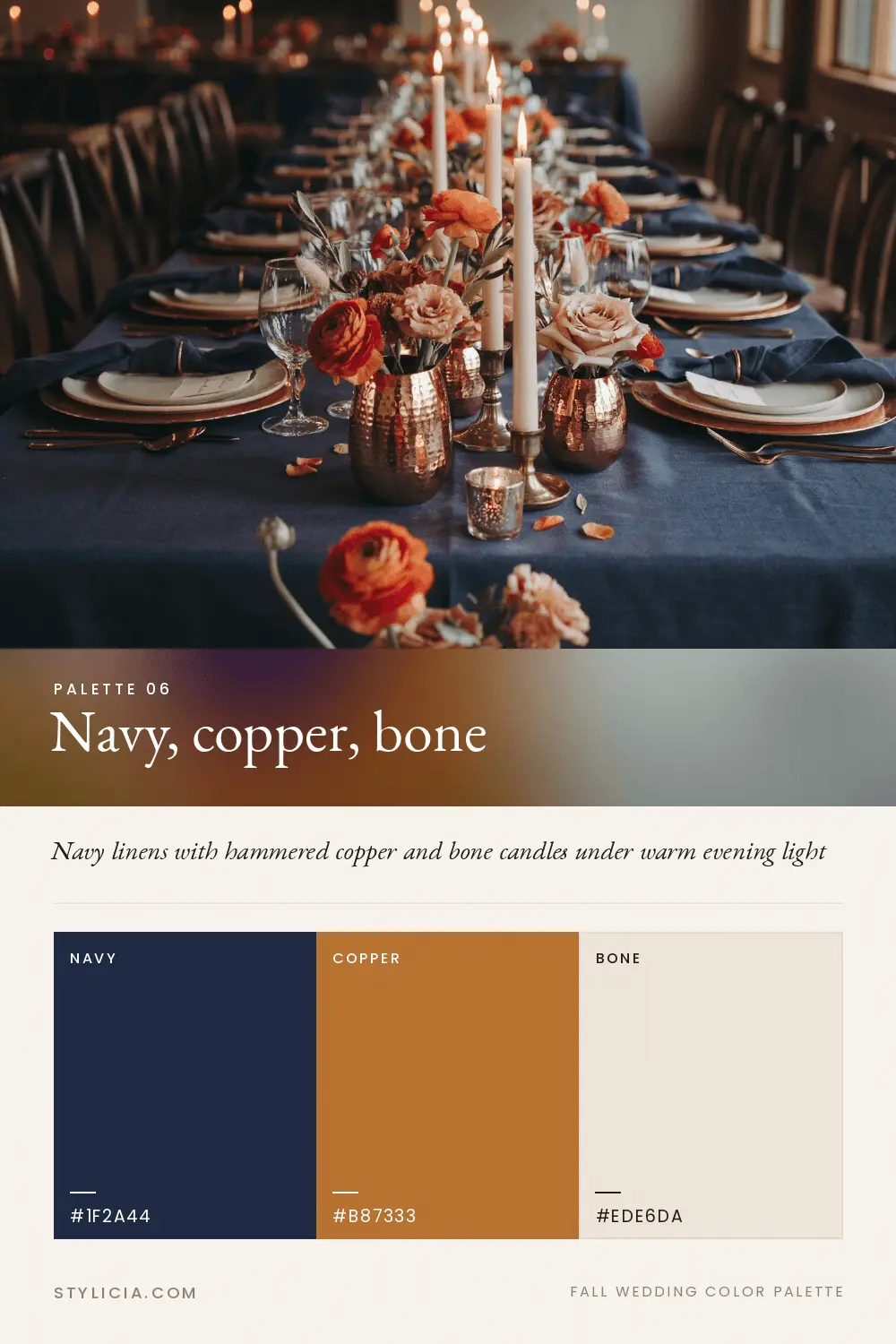
| Navy · copper · bone | #1F2A44 · #B87333 · #EDE6DA | 16% to 90% | Yes, copper carries it |
| Plum · mauve · pewter | #5B3049 · #A98BA0 · #8C8C88 | 25% to 59% | Risky, flattens |
| Sage · blush · champagne | #A3B18A · #E7C6C1 · #E3D5B8 | 66% to 84% | No, goes grey |
Read the lightness column before the colors. The two risky fall wedding color schemes have the narrowest spread, and when all three land at the same lightness a photograph turns the scheme into one haze.
Chocolate and butter yellow sit at opposite ends of that column, which is why the pairing stays legible in a badly lit barn.
Burgundy With Dusty Rose Is the Palette I Trust Most in Low Light
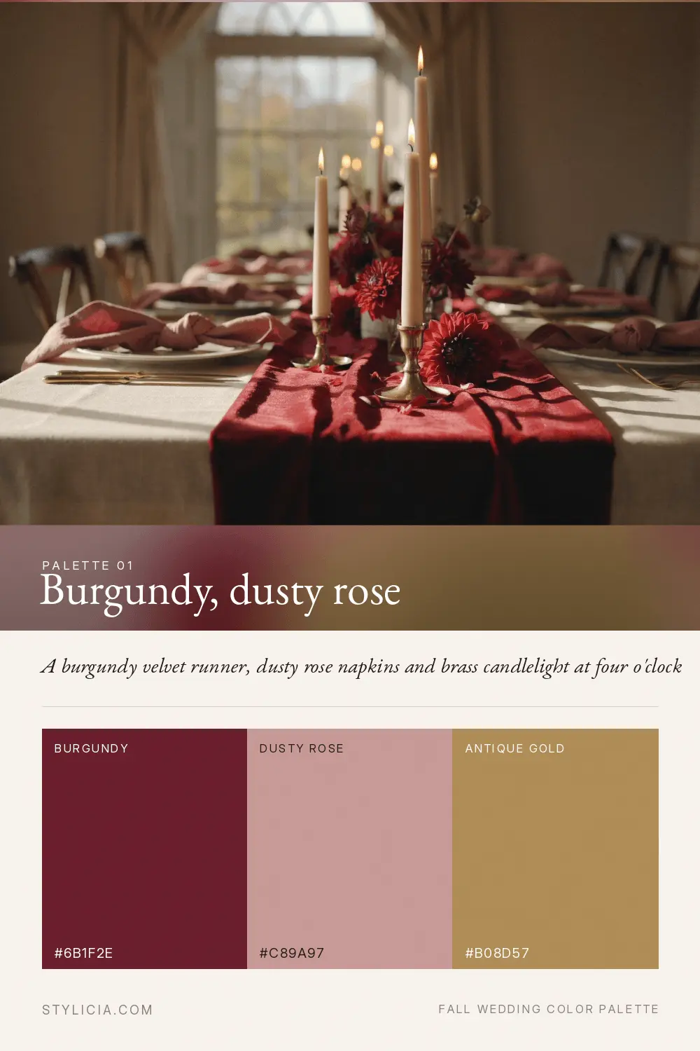
Deep red is the most photograph-proof color in autumn, because warm light gives it more of what it already has. If you want one fall wedding color palette that needs no rescuing outdoors, this is it.
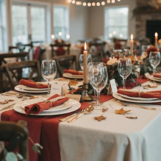
Burgundy late in the afternoon looks richer than at noon: the napkins go nearly black in the folds and glow along the edges, and the table gains a depth it did not have while the caterers were setting up.
The pairing matters more than the burgundy, which goes heavy fast alone. Dusty rose breaks it up and keeps the room from feeling like a wine cellar. Antique gold stops the metal arguing with either.
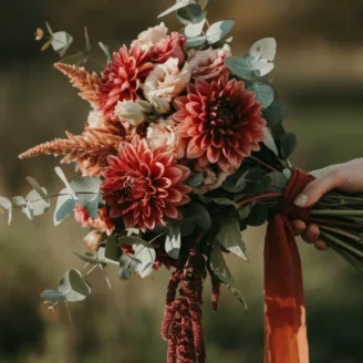
Burgundy dahlias, Black Baccara roses, Quicksand garden roses for the mid tone. Copper beech foliage rather than eucalyptus, which is cool-toned and pulls an arrangement grey.
Matte over shiny. Satin photographs a step lighter than the swatch and catches every overhead light; velvet holds the color you chose and gives the table a spine down the middle.
Dusty rose on the bridesmaids, burgundy below the shoulder line, because deep red under a face pushes red into pale skin. (The one rule here I would not bend, and the only one your photographer will thank you for.)
Champagne gold or brushed brass. Silver goes flat grey next to burgundy in warm light.
Terracotta Is the Most Requested Fall Palette and the Easiest to Muddy
Terracotta fails for one reason: people keep adding its neighbors. Terracotta, rust, copper and mustard are four versions of the same instruction to your eye. It is the fall wedding color palette where restraint does all the work.
You can watch it happen. The cloth, the napkin and the flowers stay separate while the sun is up, then it drops behind the treeline and they collapse into one orange shape, as if nobody had chosen anything.
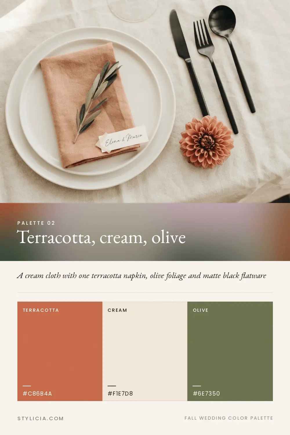
The repair is a value break. Put cream underneath or olive alongside, and keep the terracotta family to one member. One, not two that are “totally different in person.”
Terracotta and Coral Reef dahlias, rust-toned chrysanthemums, dried bunny tail grass for the cream register.
Cream cloth, terracotta napkin. Reverse it and the table goes heavy.
Terracotta chiffon photographs lighter than the online swatch, because sheer layers glow through each other. Order one dress and photograph it outdoors first.
Copper amplifies the orange and I would skip it. Matte black flatware supplies the dark value the palette lacks.
Brown Is the 2026 Neutral, and It Photographs Better Than Grey Ever Did
Grey held the neutral slot for a decade and was always wrong outdoors, because grey plus warm light equals dirty beige. Chocolate brown has nowhere to fall. Already warm, already dark, it stays put. Brown now earns the neutral slot in almost every fall wedding color palette I build.
Espresso bridesmaid dresses were everywhere by spring 2026. The fall version pairs brown with butter yellow and ivory, and standing in that room you notice the dark end and the pale end are far enough apart that everything between has somewhere to sit.
(I would bet on the brown outlasting the trend that carried it in, which is not something I would say about the butter yellow.)
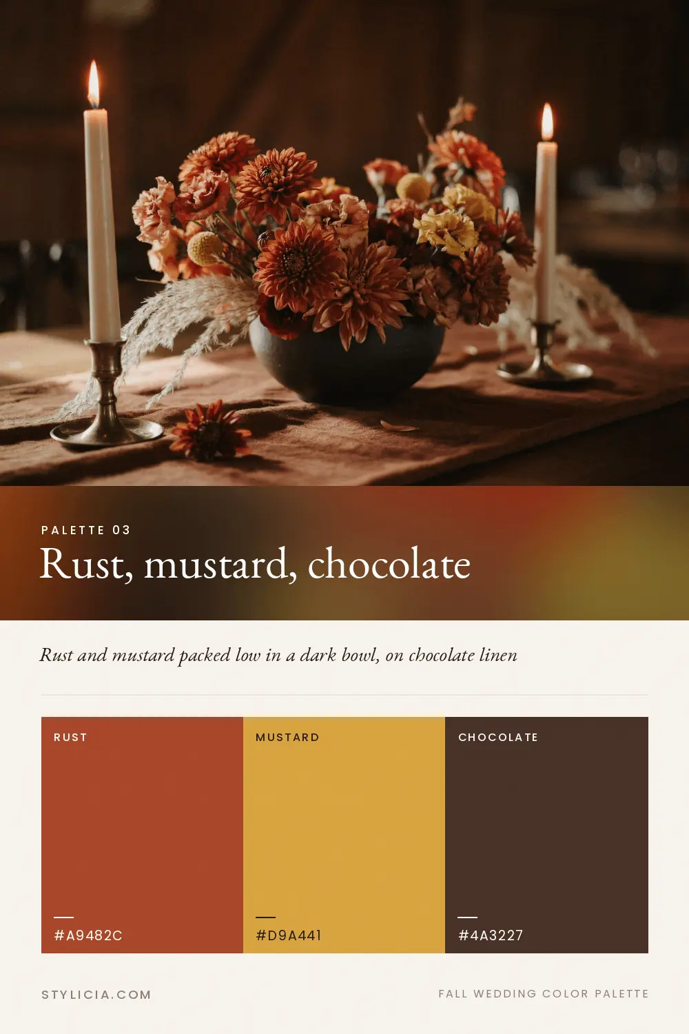
Cafe au lait dahlias, toffee roses, dried wheat, cream ranunculus. Dried and fresh mix here without looking like a compromise.
Ivory cloth, butter yellow napkin, leather or wood napkin ring. Brown tablecloths are hard to find and expensive when you find them, so brown enters more cheaply through wood: bread boards, chargers, a walnut cake stand.
Espresso satin goes nearly black in shadow and copper-brown where it catches sun, so a party of nine photographs with variation rather than as one dark block.
Antique brass, warm and dulled rather than polished.
The 2026 rustic decor shifts I tracked earlier this year covers the wood and linen textures under this one.
Cool Palettes Need a Warm Anchor or October Eats Them
Sage, mauve, dusty blue and pewter are not banned, only conditional. Each needs a warm color carrying a real share of the fall wedding color palette, not a token appearance in the boutonnieres.
Sage, blush and champagne. The prettiest palette here in person and the weakest on camera.
In late October light they lose almost all their separation, and a napkin of each laid side by side comes back from the photographer as one color. Pick a sage with a yellow bias, and put the blush on the largest surfaces you have. Fall wedding color schemes built entirely from pale tones do this every time.
Navy, copper and bone. Navy stays a solid shape whatever the light does to it, and the copper does the warming. The cool palette I would actually book in late October.
Plum, mauve and pewter. Plum is fine. Mauve and pewter sit so close together that both drift grey-brown once the sun is low, and guests end up at a table where the linen and the flowers are the same non-color.
Keep mauve in the flowers, where light passes through petals rather than bouncing off.
Don’t be afraid to run a cool palette in September and think completely differently about November. Same season’s name, different lighting.
If you are not fully committed to autumn tones, the wedding color trends I wrote up for a vibrant celebration covers the brighter end of this.
Match Your Fall Wedding Color Palette to the Hour of Your Ceremony
Daylight saving ends on November 1 in 2026, and it takes a full hour off every wedding after that date. One line on a calendar does more to a fall wedding color palette than any decision about flowers.
A mid-September ceremony still has warm usable light well after seven, which is why sage and dusty blue survive early in the season. By mid-October it is gone before six-thirty.
By mid-November the sun is down before most receptions have finished the first course, and everything guests see after that is light you paid for.
(Look up your own city, though. A few hundred miles inside the same time zone moves sunset by a quarter of an hour.)
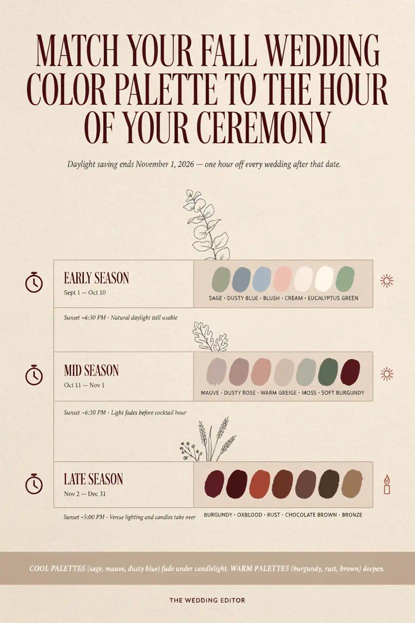
Once the clocks change, the room runs on venue lighting and candles, both warmer than late sun and harder on cool colors. Burgundy, oxblood, rust and brown improve under it. Sage, mauve and dusty blue do not.
Candlelight becomes structural then, and what you want from it is height and repetition: a line of flames down the middle of a long table, catching on brass and glass, rather than one cluster in the center.
Antique brass taper holders in mixed heights sell for $25 to $45 a set, and six per table is where a table looks lit instead of decorated.
The Same Hex Code Looks Like Three Colors in Three Fabrics
A hex value describes pigment and says nothing about how a surface handles light. Satin reflects, so a dress photographs a step lighter than the swatch did. It is why a fall wedding color palette has to be tested in fabric, not on a screen.
Velvet absorbs and goes a step darker. Chiffon transmits, which is why a chiffon skirt in the last hour of daylight looks lit from inside while the satin beside it just looks bright.
Dye lots are the other trap, and I would treat one order from one retailer as a rule. Let the whole party order separately and two dresses come back noticeably pinker.
(Invisible in the room, obvious in the album, which is the version that outlives the day.)
Rental linens are named, not numbered. “Rust” at one company is not “rust” at another, so ask for swatches; most rental houses mail them for a few dollars.
Where a Fall Wedding Color Palette Goes Wrong
Five failures account for almost everything that goes sideways with a fall wedding color palette.
Every color at the same lightness. Terracotta, rust and mustard sit in the same middle band, so the photograph has no contrast in it. Fix: force one color much darker and one much paler.
Choosing on a backlit screen. Your monitor is cold and bright. The wedding is warm and dim. Fix: judge physical swatches at the venue at your ceremony hour.
Ignoring the venue’s own colors. Red brick, a green lawn and a patterned carpet are in every photo already. Fix: count the venue as one of your three.
Five colors instead of three. Each extra color halves the impact of the ones you started with. Fix: demote two to something a guest has to hunt for.
Buying the swatch in the wrong sheen. The one here I have no clean fix for. Matte and satin in the same color are two different colors on camera, and most rental listings will not say which is coming.
When You Want to Push the Palette Further
Change one variable, then judge it from photographs rather than from the room. And let one color take most of the room while you do it. A fall wedding color palette fails from being split evenly more often than from being wrong.
Widen the value range instead of adding a color. Swap the cream for a bone, the terracotta for a rust. Twice the contrast, no new color.
Add a fourth color at a whisper. One unexpected note through the ribbon and the escort cards, and guests notice the table without knowing what they noticed.
Chartreuse in a burgundy scheme. Powder blue in a rust one. There is no correct fourth color, and the ones that surprise people come from outside autumn.
Change sheen instead of hue. Same burgundy, velvet runner instead of satin, and the table goes from bright to deep with nothing new entering.
Metal works the same way: copper in a terracotta scheme pours more orange onto a palette that has too much already, while matte black hands it the dark value it was missing.
Matte black flatware sets run $30 to $60 for twenty pieces, which covers four settings, so price it against rentals first.
Frequently Asked Questions
What are the most popular fall wedding colors for 2026?
Chocolate brown, burgundy, terracotta and butter yellow, with brown taking the neutral slot grey used to hold. Sage and dusty blue now read as early fall wedding colors, best in September and at indoor receptions. Any of those four works as the base of a fall wedding color palette.
Does burgundy photograph well outdoors in October?
Better than anything else here. Warm light adds red and orange to whatever it hits, so burgundy gains depth as the day goes on. The only color on this list that looks better in the album than it did in the room.
What colors should I avoid for a November wedding?
Sage, mauve, pewter and dusty blue. Once the clocks go back the reception runs on candlelight and warm bulbs, and those four go grey-brown under it.
How many colors should a fall wedding color palette have?
Three, plus one metal. A fourth works if you keep it small enough that a guest has to look for it, chartreuse ribbon on the escort cards and nowhere else.
Is terracotta still in style for 2026 weddings?
Yes, and by a wide margin the most requested fall wedding color palette. The problem is never the terracotta. It is pairing it with rust and copper and mustard until the table is one orange shape.
What metal goes with a fall wedding color palette?
Champagne gold, for almost all of them. It is warm and pale enough to reflect candlelight instead of fighting it. Antique brass suits brown and oxblood, copper belongs with navy, silver goes flat grey late in the day.
Can I use black in a fall wedding without it looking like Halloween?
Proportion decides it. A little black against bone and oxblood looks formal. A lot of it with any orange in the room goes the other way fast. Keep black on the linens and the paper.
What are the best early fall wedding colors for a September wedding
Early fall wedding colors can stay lighter than the October set, because September light sits higher and carries less orange. Sage with blush and champagne, or dusty blue with terracotta and bone, both hold at a two o clock September ceremony and come apart six weeks later. Booked before the equinox, you can borrow from summer. After it, anchor everything with a warm color.
Shop the Look
- Interior paint fan deck, real pigment you can carry to the venue, $10 to $25
- Burgundy velvet table runner, matte holds color where satin lightens, $18 to $35
- Terracotta linen napkins, the layer worth owning rather than renting, $20 to $40
- Antique brass taper holders, mixed heights, six per table, $25 to $45
- Matte black flatware, the dark value a warm palette usually lacks, $30 to $60
Pick Two Colors, Then Add the Third
Pick the two you actually love, check that one is clearly darker than the other, then choose a third to fill the gap. Your favorite colors get to stay, and the arithmetic happens afterward. That is how a fall wedding color palette actually gets built.
If you do one thing this week, do the swatch test. Twenty minutes at the venue settles the argument you would otherwise have in March. Your fall wedding color palette is settled at that point. Then take the winning three into the full fall wedding decor guide and start assigning them to surfaces.
- the full fall wedding decor guide this palette feeds into
- how black and burgundy plays out across a whole reception
- which fall flowers are actually in season
- napkins, chargers and linens for autumn tables
- the wedding color trends I wrote up for a vibrant celebration
- the 2026 rustic decor shifts I tracked earlier this year